What do they know?
Since the Roswell Incident in 1947, UFO’s have been associated with secretive military installations where mysterious craft dart across the night sky. Skeptics might hold that many UFO sightings, far from being extraterrestrial visitors, are better explained as experimental or conventional military craft. Does this association hold, though, in light of the wealth of UFO sightings collated by NUFORC? Are UFO’s more likely to be seen when in close proximity to a US airforce base?

As a first step to approaching this question, we can rely on the reported NUFORC data of UFO sightings, and the US government’s conveniently thorough dataset of military installations.
Before performing a more robust statistical analysis, we can quickly combine these two datasets to see if any obvious visual patterns emerge. As always, visual analysis comes with the strong caveat that apparent patterns must be backed up with real statistics. Beware eyeballs.
We will focus only on sightings in the United States. Whilst the NUFORC dataset is creditably global the reports are overwhelmingly from the US, reflecting the fact that NUFORC is largely a US-based endeavour and is much less likely to receive reports from elsewhere in the world.
For this quick visual exploration, we will produce a density plot, or heatmap, of UFO sightings going back to 1906, using the excellent spatstat R package, as described in Baddeley, Rubak, and Turner’s Spatial Point Patterns: Methodology and Applications with R.
The first task is to transform the data appropriately from the weirdly non-Euclidean geometry of longitude and latitude to a geometry that allows for consistent measurement of distance between points. Following this we can run a standard kernel density estimate of sightings that, briefly, produces a probability distribution over the analysed space that estimates the likelihood of a UFO sighting at each point.
The output of spatstat’s density function is a pixel image, appropriate for plotting in R’s base graphics. As fanatical devotees of the cult of ggplot2, however, we instead convert this image to a raster suitable for plotting with ggplot’s geom_raster.
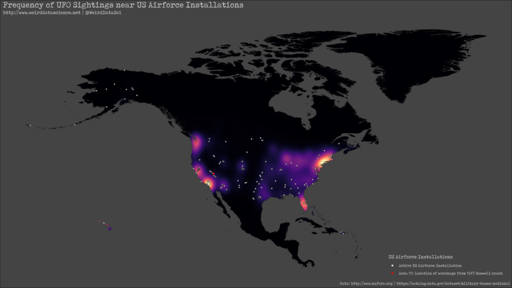
With the density plot calculated we can load the US military base data and perform a similar transform from longitude and latitude to Euclidean space. We then restrict the data to each active US Airforce installation, and plot the resulting set of points over the underlying density plot of UFO sightings. Being worthy of special attention, we highlight the location of Area 51.
At a first glance, there do seem to be correlations with particular clusters of airforce installations and UFO sightings. It is immediately obvious that sightings are much more common on the coasts of the US than in the centre of the continent, although the relatively sparse population density might go some way towards explaining this phenomenon.
The next step in this analysis, which we will carry out in a future post, will be to conduct a formal analysis of the correlation between the sightings density and the distance from airforce bases. From our initial observations, however, dark suspicions have already been raised.
You can keep up to date with our latest tearings of the mathematical veil on Twitter at @WeirdDataSci.

Be the first to comment
This site uses User Verification plugin to reduce spam. See how your comment data is processed.